Absolute Blog / Creative

  • Posted 15/02/2024 by absolute

    Making Your Website Stand Out in 2024

    The web design industry is constantly evolving and 2024 will be no exception. With new technologies, user preferences, and design standards, web designers are embracing the latest trends and best practices to create websites that are engaging, functional, and attractive. Here, we explore some of the web design trends that we expect to dominate, and how Absolute Media Brisbane can help you implement them on your website.

    1. Full-Screen Homepage Hero Section

    Full-screen hero sections act like a huge billboard for your website. They immediately capture user attention and deliver a clear communication with few distractions.

    A full-screen hero section is a great way to position your business, and to set the scene for your business, brand or product. You of course need an image with meaningful content that adapts to different browser sizes and so avoids being cropped in a way that ruins the design.

    Don't worry about putting your content ‘above the fold’. The idea that users won't scroll down to see more information is outdated, as most users are used to scrolling on their devices.

    2. Graphics with Photos
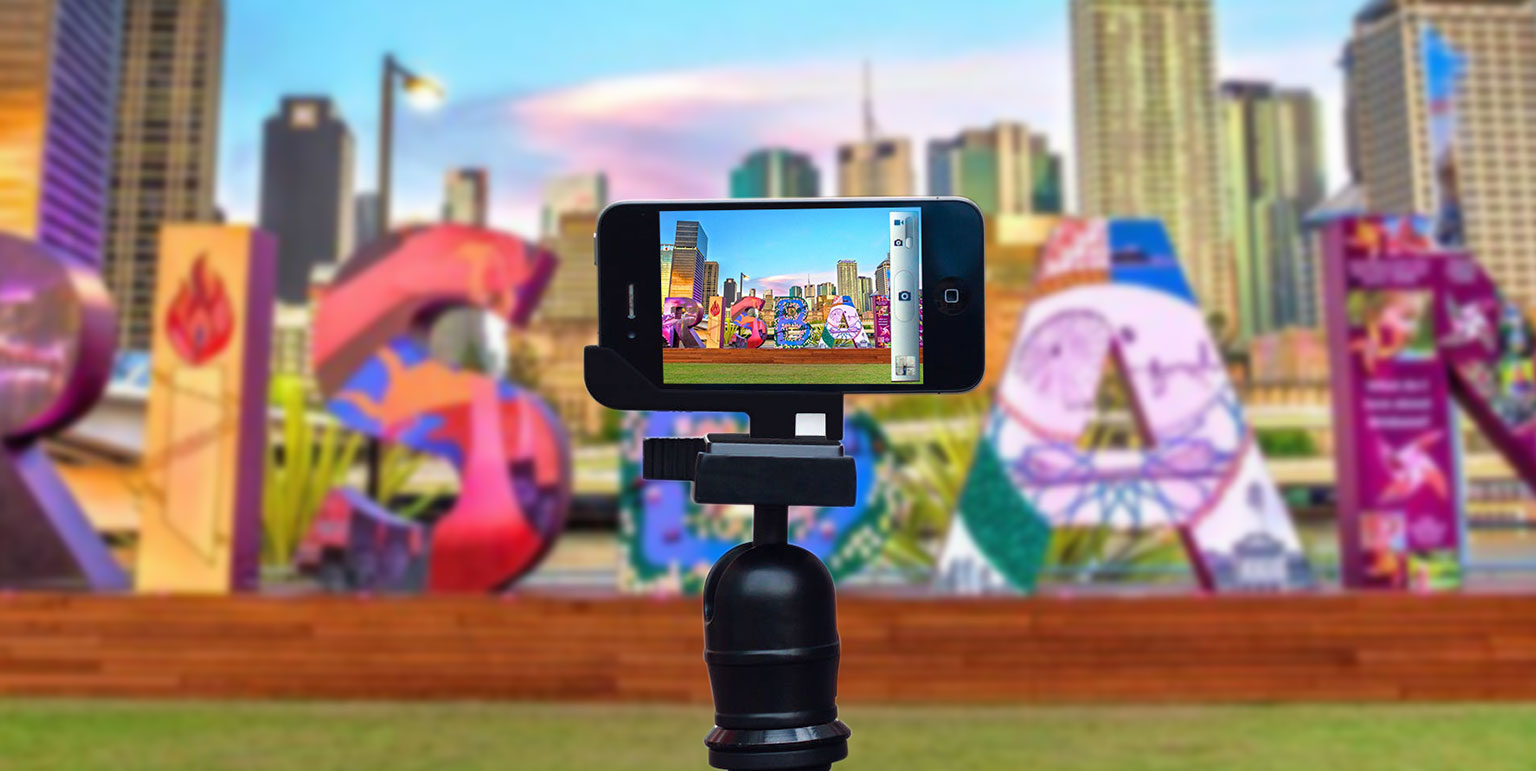
    You will doubtless have seen images on social media that include graphic overlays. This technique adds creativity, depth and relevance to otherwise regular images. Combining photos with graphics can enhance your brand identity, helps to visually connect your content, and has the added bonus of keeps your website visitors interested in your content, plus done correctly, making it memorable.

    3. Responsive Design

    Not a new trend, but still a crucial one. Responsive design means that your website adapts to different screen sizes and devices, ensuring consistent and optimal user experience across all platforms. Responsive design is not only important for usability, but also for SEO; Google favours websites that are mobile-friendly and perform well on smartphones and tablets. Absolute Media can help you create a responsive website that looks great and performs well on any device.

    4. Dark Mode

    Dark mode is a popular option for many users who prefer a darker background for their websites and apps. Dark mode helps reduce eye strain, save battery life, and create a sleek and modern aesthetic. Dark mode can also make your website stand out from the crowd, as many websites still use light backgrounds. Absolute Media can help you design a website that offers dark mode as an option for your visitors, or even as the default theme.

    5. Less is More - the Art of Minimalism

    Minimalism is a design trend that’s been around for decades but, in the communications industry, it is still very relevant and effective. Minimalism is the art of using less to achieve more. By eliminating unnecessary elements and focusing on the essential ones, minimalism can make your website look clean, elegant, and professional, as well as improve its loading speed and usability. We can help you create a minimalist website that showcases your content and brand without any distractions.

    6. Micro-Interactions

    On websites, small animations help to provide subtle feedback to your visitors. A good example of this is when a button changes colour when the user hovers their mouse over it. Focussing on these points of micro-interaction on your website, helps bring attention to the details that you ideally want visitors to focus on, and engage. Things like subtle movement, slowly shifting gradients, scrolling animations and parallax, or changes to the mouse icon when you click an element are all possible instances where micro-interaction can be used to great effect.

    7. Micro-Animations

    Micro animations are extremely useful for holding attention, and guiding users to key aspects of your website. Thinking about how content moves, when loading, when scrolling or swiping, when hovering can bring really effective enhancement to your user experience and present more dynamic qualities, if that’s your thing.

    8. Dynamic Cursors

    Customizing how users interact with your web elements with the cursor is both a cool and creative way to enhance your users’ experience. Changes the shape of a cursor, it’s colour and how it behaves when key events are triggered works as an effective and albeit sometimes slightly distracting technique which has gained popularity recently.

    9. Interactive Content

    Interactivity on your website is a great way to get your visitors engage, to pull them deeper into your content, and for your business to find out more about them.

    The moment that a visitor starts interacting with your site content, their experience shifts from passive to active, and the conversion experience begins. Think of things that can help your prospects to make informed decisions, and deploy content like interactive event calendars, estimate calculators, animated infographics, questionnaires, resource libraries, maps and survey results to increase the likelihood of generating more new enquiries.

    10. Custom Illustrations

    Illustrations are an obvious way to make your website more unique and memorable. Illustrated custom-made graphics can also reinforce your brand personality, message, and tone in a creative and engaging way. Illustrations can also bring colour and qualities such as humour and emotion to your website, making it more appealing and relatable to your audience.

    These are just some of the web design trends that we expect to dominate, but there are many more to explore and experiment with. If you want to make your website stand out this year, Absolute Media Brisbane can help you with all your web design needs. Contact us today for a free consultation and quote.


  • Posted 30/10/2020 by absolute

    Lasting First Impressions

    Yet More Important Logo Design Considerations

    Logos are generally regarded as artworks which assign a recognisable identity to a business, make it memorable (hopefully for the right reasons) and potentially communicate ideas which add value to the brand.

    When approaching the design of a new logo requiring some sort of symbol, device or pictogram, one of the primary strategic considerations that your designer should be making is whether the symbol or device should be literal or conceptual.

    Conceptual versus Literal Design

    “It’s just a repetition of the name as a nice graphic. So what!?”

    This might sound somewhat psychoanalytical, but often I find my inner monologue rambling to literal logo designs in this way quite a lot. Yeah, it’s a Red Hat. What do they do again? Umm … software. It’s actually a really unstylish red panama hat. Or is it a trilby? What were they thinking when they approved that one?
    Perhaps I overthink them a bit too much, but probably not. Because the chances are that your clients will have similar reactions (subconscious or otherwise) about your designs, materials and branding when they are dealing with your business.

    In short, a dentist logo doesn’t need to show teeth, a construction firm’s logo doesn’t need to show a building (or a hammer) and a smartphone makers logo doesn’t need to show a smartphone.

    It is of course debatable but, to us at Absolute, the primary function of a logo is to say ‘Here we are, remember us.’ Whilst images that are relevant to the business and can perform perfectly well as identifying marks, we find it far more meaningful when a logo design communicates something about ‘who they are’ rather than ‘what they do’.

    Humans like to recognise visual patterns and solve puzzles. To most it is far more engaging when the brain is required to make the connection between logo device and business name. We have the innate ability to engage and figure things out, and when we make the association between image and company name, we connect on a deeper level. As well as making the design more memorable, done effectively this can also help to unlock the core qualities of the product or service.

    To help illustrate the point, I’ll run with a few examples, the first of which only recently dawned on me.

    The straight-up lettering and the cheeky little smile beneath it are fairly apparent. But, notice where the smile leads from and to, and the small arrowhead at one end? Yes that’s right … Amazon, everything you need, from A to Z.
    The Baskin and Robbins logo is a great, high profile example too. Tucked away in the playful ‘BR’ initials are the numbers 3 and 1, referencing the 31 flavours that they are famous for selling.
    Perhaps less well known, but a useful example, is the Museum of London logo. At first glance it just looks like some overlapping biological shapes surrounding the text. The colours in-fact represent the changing borders of this famous city throughout its history. But enough of the reveals. Check out the FedEx logo, have look Cisco’s emblem and, maybe not overly obvious, but see if you can figure out what Hyundai’s logo symbol means … if anything.
    One thing is certain; once you make the connection between conceptual design and message by realising what you are looking at, and what it means, it will commit the name and associated values to memory for a much longer than pretty much any literal logo design combo.

  • Posted 28/11/2017 by Will.N

    Production quality video – no cameras required

    Corporate video has long held its position of stature in the library of marketing materials that an established business is expected to have. In recent years video has proven doubly important as both a unique source of moving web content for landing pages and homepages, and as a mechanism that boosts Search Engine Optimisation rankings in the eyes of Google, Bing and Yahoo because it is considered as an indicator of ‘quality content’.

    In the past 15 years Absolute Media has been involved in the production of high-end video content for Queensland Health, DIAGEO and the University of Queensland amongst others. However, with an increasing thirst for video content, and the means to film great quality video by anyone with a smartphone, there is now an acceptance that corporate video itself doesn’t need to be as slick, production polished, and interspersed with flash motion graphics as it used to be. Lower quality web video expectations have steadily eroded the demand for slick high-end video. When an estimate lands complete with the cost of directors, cameras, audio, props, pre-production and post-production, motion graphics (and the rest) it’s often initially perceived as overly expensive, especially when a person can record something to their phone, edit it themselves on PC or Mac, then upload it themselves and have it embedded on a website, essentially for a few bucks and a bit of their own time.

    That said, budget video doesn’t have to equate to cr*p quality. It’s definitely possible to not use a camera at all, by doing so keep the cost to a minimum, and yet still produce a slick corporate video production. One recent point in case was for our client Forklift Action who were attending a large international exhibition in Germany, and who needed video content to use at the centre of their stand on a large LCD display screen.

    With a basic script, some still images and the purchase of a few stock video segments from popular libraries such as iStockphoto.com, we had everything we needed to create the following video.

    Also in-terms of additional benefits of having and integrating video to your website, please also consider … Google owns YouTube, so video hosted on YouTube will of course be ranked even more favourably than on other platforms such as Wistia or Vimeo!

    If there’s a hole in your website where some custom video content would be a great addition, call us today to discuss what we can do for you.

  • Posted 29/06/2017 by Will.N

    Brochure fold types – a reference guide

    As a graphic design business that specialises in brochure design, one of the conversations that we regularly find ourselves having with clients concerns the form that their printed brochure might take and how it might be folded. Fold types can be very effectively used to gain more interest, to better support the main selling proposition, or to simply sidestep the norm.

    So, to help ourselves as well as to provide a handy reference guide for our clients, we’ve gathered together a selection of the most popular fold types used for printed documents with four, six, eight, ten and sixteen pages as a convenient list for anyone considering sales leaflets, brochures, direct mailers or newsletters.

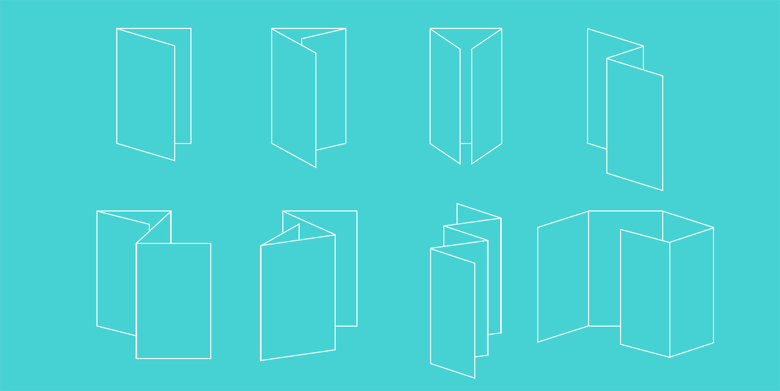
    The Half-fold, also known as the single fold or book fold, is mainly used for brochures and newsletters, and works well in both landscape and portrait formats. The most common instances are as A4 portrait brochure, opening up to a landscape A3 size, but it can be used at many varied sizes and is still most commonly seen in newspapers.

    The classic Tri-fold, also known as a letter fold, roll fold or c-fold creates a six panel format and presents a great, compact document with good surface areas both inside and out, making it easy to read and fold back together again. These are particularly effective because the three-page centrespread provides a great space with which to communicate your key messages and make serious impact. We often consider ‘the larger the better’ and these work really well at A4 portrait size (when folded), but can be commonly seen at DL size (folded) which opens out to a horizontal A4 sheet of paper. The outside right panel can often be used to great effect too with a sales proposition or conceptual focal point, or by trimming the front cover right edge to reveal some of this page, which sits beneath the cover when folded.

    Roll folds can be also be effectively used for eight, ten or more pages if desired, as can the below z fold. Having more pages enables these types of documents to carry more text or communicating info heavy designs so are perfect for promotional leaflets, programs, tutorials and step by step instruction guides.

    The Z fold, also known as a zig-zag, fan fold or accordion fold is simply a different way of scoring and folding a tri-fold. Instead of folding the third panel in from the right, it’s folded out, making a z shape with the top edge. It is commonly used for flyers, mailouts and brochures, and of course for folding letters so that they fit into a DL envelope.

    Die-cut z fold. Take the flat z fold artwork, cut a horizontal angle from left to right and then fold it together to create a document with an angled front panel which is shorter in height than the middle and back panels. Simple difference, great impact.

    The Gate fold, double fold or window fold format is perfect for graphically-heavy designs. Gate folds also create a six-panel document but, with the two outer panels being narrower than the central panel, the format presents a brilliant way to tee-up then present the message by the reader having to open up the document like a pair of saloon doors.

    Double gatefold brochures constitute four panels, so eight pages. The two ends of the sheet are folded to meet in the middle, and the document is then folded in half again. They are ideal for large presentations and for small format product sales brochures or catalogues with limited but numerous products.

    Double Parallel folded documents have four panels, which creates eight pages. Whilst they may sound confusing, the quite simply consist of an often wide and short flat rectangular sheet, which is first folded in half, and then in half once again in the same direction.

    French folds are made by folding a sheet in half vertically, and then horizontally. The two folds create eight panels, four on the front and four on the back. This enables a document which when folded is the size of a booklet or brochure, which when opened expands to a final size that feels like a poster. This format is most commonly seen with maps and charts, and can be used to great effect with newsletters or for promotional items for where many individual products or events need to be included.

    We hope that you now feel fold-enlightened but if you still have questions about a format that we haven’t explained – think origami – we’re only too happy to help, so drop us a line or call to discuss.

  • Posted 17/05/2017 by Annie.K

    Logo design: important considerations

    logo design considerations brisbane

    It's back to the design school drawing board! We decided that it would be beneficial to revisit the key logo design considerations if you are planning to have a new logo developed, both as a refresher for us and as a guideline for you if you're after a distinctive and individual result.

    The logo design process is regularly a very emotive journey where the outcome has to satisfy the needs of both you - the client - and your customer audience, even though you may have differing subjective viewpoints.

    Fundamental to this is a good understanding between you and your designer, because ultimately it could take a lot of work and revisions to get the across the finish line. Without a good rapport the result will most likely end in compromise.

    What's the point? Logo design considerations

    Effective logos allow clients to connect with and recall the values of a business and brand. To be successful a logo should be recognisable, and therefore needs to factor colour, style, typographic and size considerations into a unique device. Establish a concept and find an individual and original way to visually communicate it.

    Avoid overused imagery

    It's VERY difficult to communicate your individuality with a jigsaw puzzle piece (i.e. 'we are the missing piece' concept) when it's one of the most overused graphic images EVER. There are many established themes in logo land and you would be wise to avoid having something that you like re-worked because you think it's a good fit. Instead consider the basis of your business, its unique qualities, its personality and individuality, what it means to your customers … and question how this might be communicated with graphics and words.

    Don't just decide on price

    You know we would say this. Corner cutting is a necessity in the first months of any new business, but we (as almost certainly every other design agencies has) have seen clients who unfortunately have realised that their off-the-shelf, cheap-o design doesn't meet the needs of the business 18 months in. A lot of clients already know this, and are acceptant of the fact that someday soon they'll get the logo redesigned. What they don't always comprehend are the implications of not just reproducing new materials, but the problems of having to effectively communicate the update to their customers with the new identity, especially if there is a new name too.

    Consider scalability and reversal

    With a mind-blowing plethora of media to apply your logo to, it's important that a design is legible in the smallest available space (think web page favicon)  and that it will look schmicko on that Flinders St digital advertising space that you've been promising yourself once you've make your first million. So don't just look at your prospective logo design in isolation. Question where it's most likely to be seen and how it might look in those environments. The perfect result will provide you with a seamless translation of your brand across a wide variety of different platforms

    Simplicity is the key

    A famous designer once wrote that 'Design is so simple. That's why it is so complicated.' In light of each nugget of advice that we've outlined above, the overwhelming opinion is that simplicity really is key when it comes to recalling your logo design.

    There are of course an infinite list of considerations when navigating the logo design process and these are just some of them, albeit the most important ones. To discuss your logo design Brisbane needs, call us now on 07 3300 6308 and we'll take the journey together.

  • Posted 17/04/2017 by Will.N

    Infographics: making data meaningful

    brisbane infographics design

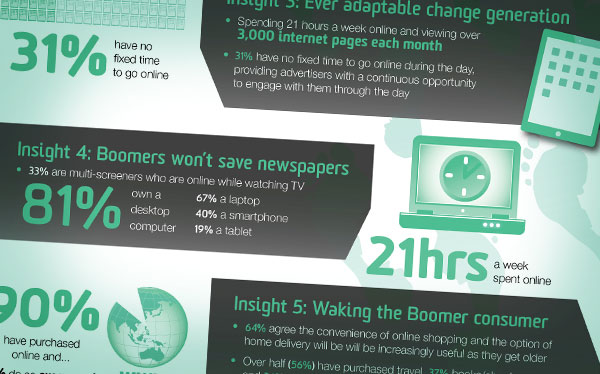
    The process of creating and visually representing information, once known as data visualisation, has recently become more popularly known as 'infographics' or 'data viz' if you're really cool. These intriguing visual representations of report findings, data or knowledge have become very popular in the business world, and when you examine the various reasons why, it’s not surprising.

    Infographics allow complex content to be communicated quickly, clearly and often memorably.

    Far more eye-catching, interesting and visually engaging than pages and pages of data, their rationalisation down to a number of key indicator statistics, combined with the use of images, and brief bursts of summary text, done effectively, can give an injection of life to even the most snore-inducing report findings.

    So if you are considering using your latest report findings to create a stunning graphical representation, exactly where and how can your business benefit from this investment?

    1. Searchability

    In a world where we now use the internet to constantly search for answers to questions, detailed information neatly packaged as an infographic is hugely eye-catching. Having made your content easier to identify, examine and digest, especially for a search hungry public with a very short attention span, infographics are search result gold, guaranteed to get click-throughs to YOUR site, rather than to your more verbose, less visually striking and possibly even boring competitors.

    2. Shareability

    By being attractive eye candy, easy to find on the web, and extremely helpful, infographics are also immensely shareable. An extremely effective way of driving traffic to your website, they are great attractors of backlinks from online articles, promoters of link sharing, and generators of embedded links to other websites. People that find them, talk about them and share links to them with their social networks, the net result of which is increased traffic to your website and improved search engine ranking.

    3. Credibility

    The businesses that create and publish infographics increase the stature of their own corporate profiles by doing so. Companies that publish and promote industry specific information are perceived as credible authorities by their peers. Doing this with meaningful and reader friendly visuals generates credibility … with bells on.

    4. Printability

    Data visualisation has always been popular in corporate annual reports brisbane, in the form of graphics such as bar charts and graphs. Infographics are becoming even more so; representations of data as meaningful graphics make report content far more communicative, and even more impressive and, dare we say it, put a positive spin on results which might suggest otherwise.

    Such has been the impact of infographics originally commissioned for digital use, that we get also regularly get requests to produce the artwork as posters and graphics for boardrooms, offices and exhibitions.

    The long and short of it is that infographics rock. They're the zeitgeist, they're here and now … and they work wonders.

    Contact our Brisbane office today and we'll gladly email you examples of the infographics we’ve produced for the likes of Intel, NineMSN and GE.

  • Posted 17/08/2016 by absolute

    The downside of great branding

    As a graphic design studio we are partner to lots of small businesses and a handful of large corporations. Amongst the small to mid-size companies the term ‘Branding’ is regularly misunderstood, and furthermore it’s often dismissed as being something that only large corporates need worry about.

    For the benefit of those naysayers, this article gives a few ideas about how small businesses can build strong brands too, and in doing so develop greater relationships with their customers.

    To begin with, we find that many small businesses fail to take advantage of the opportunities that branding offers because of their own preconceptions of what it is. The three responses we tend to witness include:

    Branding … that’s just another word for a logo isn’t it? Well no, actually it concerns the vision and values of your business; in essence it’s personality and the promises that it makes to your customers.

    Branding … that’s just a fluffy marketing term! Ha. Brands in-fact appeal to our emotional selves and like it or not, everyone has their own instant emotional reaction to your brand, because humans are wired to do exactly that. In considering branding ‘fluffy’, some folk are ignoring the fact that those instant reactions are an opportunity to engage and communicate with their customers at an instinctive level.

    Branding … that’s for multinationals with fast moving consumer goods. Traditionally it was. However many service related business came to realise that their customers were only able to make a judgement about their services after the purchase has been made. Whilst products have tangible benefits, services have no taste, touch or smell. They can only be experienced after they’ve been bought. Service business started to realise that as part of their sales, they needed to build confidence and a level of trust that they were the right choice for the customer, prior to the sale.

    The very essence of Branding can therefore be used in a variety of ways in support of the businesses desired outcome:

    To influence choice

    To build loyalty and advocacy

    To command a premium price

    To provide differentiation, particularly in highly competitive markets

    To provide a platform for growth.


    This means that across any business mix of promotional materials, customer and sales service, websites, advertising, marketing collateral, and yes … logos, the brand identity can be developed to communicate a range of recognisable traits and positive qualities:

    Pride - professionally designed logos and brand identity systems show that you are committed to presenting as a strong contender in your industry.

    Visibility – the majority of prospective customers look for highly visible, well-defined and reputable businesses when seeking to make a purchase. The look and feel of your identity plays a major role in the decision making process, particularly in an ecommerce environment where their only experience of your company prior to making a purchase is the website and content itself.

    Credibility - credibility with strong visual messaging in a professionally developed branding system, used throughout all business and marketing communications is how many of the most successful corporations stay one step ahead of their competitors.

    Appearance – your brand identity positions your business to work with larger organizations. This helps to increase margins by setting premium rates for your products and / or services.

    Retention – humans are visual people, and most people remember the things that they see, better than the things they read or hear.  A consistent visual identity for your business and marketing communications will keep you at the forefront of current and potential clients’ minds when they require your products and services.

    Stability – when you’re not in a position to claim that you’ve been ‘in business for 25 years’, a purposeful branding system can build the impression that your business is dedicated to the industry.

    Differentiation – if they follow the direction of your strategic marketing plan, then a professional logo and a strong identity system will enable you to position your business succinctly, and in the right place in relation to the competitors in your market.

    One great example of a small business reaping the benefits of a deliberate move to branding itself professionally is Brisbane based Exhibition & Display Services.

    Originally established for the Brisbane Expo in 1988, they are a very well established business with many longstanding customers. However their external communications were suffering from a combination of fundamental errors, the sum total of which was creating a lack of professionalism and emotional appeal, both of which are paramount in the minds of prospective customers looking for competency and experience in exhibition design and event hire services in Brisbane.

    In a steady approach over an 18 month period they have had their logo redesigned, then their website redesigned, then their business stationery, product catalogues and so on (all by us of course). The design approach itself sought to leverage the positive and more identifiable aspects of their existing materials, mainly the colour scheme, so that there rebranding was more of an evolution rather than completely throwing the baby out with the bathwater.

    With the introduction of clean bold lines, confident design typography, and a Swiss style colour palette approach with a breakout of complimentary swatches to enable navigation of their broad event hire product range, they’ve ‘honed’ themselves and in-doing so have created great pride within the business, and great interest from new customers. Our headline for this article was inspired because they’ve been almost too successful, with renewed interest in products and services making them almost too busy!

    Ultimately a brand has to be nurtured. Good branding takes time, thought and consistent application, but that doesn’t equate to a big budget. A good branding mindset requires both discipline and passion. It’s about caring for the big picture and the small detail.

    To discuss your branding, call us now on 07 3300 0494.