Website design is incredibly fast moving. By experiencing the very latest interface developments on a continuous and evolving basis, visitors will opt to browse elsewhere the instant that a site they’re viewing fails to meet their expectations. To give this claim some relevant context, here are a few of our observations about where it’s at right now, and why:
Long scrolling pages – started with the goal of getting visitors onto a specific landing page and converting interest into action. Landing pages typically contain sufficient information needed to allow an informed decision and numerous prompts to ‘contact for more info’, ‘sign up for details’, or ‘get in touch NOW’. Often with zero navigation options at the top of the page, they essentially focus the purchase decision to a very clear YES, or a NO.
Landing pages have evolved into an easy to navigate and anticipatory experience; it’s far easier to swipe your finger up on a mobile phone than it is to locate the menu button, then choose the next page or info that you want to read. Additionally, viewers now typically scroll further and further to see what else is on a page before choosing to move on, and a well-balanced page with excellent content, features and functionality will tease them down, down … and further down.
Easy navigation – mentioned above but now essential to keeping visitors on your site, smartphones are still considered fiddly for more detailed activities. No one really wants to type a report on one when there’s a real keyboard available, do they? That said, smartphones are now the most used device around the world between the hours of 7am – 10am. Mobile usage now accounts for more than half of the world’s internet browsing traffic and logically, mobile user interfaces need to provide the ability to explore a site quickly and easily. Hence the growth in popularity of longer scrolling pages. But what other implications does this have? How about a less complex navigation menu structure? How about a large clear nav menu that fills the screen rather than running along the top edge of the screen? Why do I have to scroll all the way back to the top of the long scrolling page? That’s right. Sticky menus - which hide when scrolling down, but re-appear when a slight upwards gesture is made - back to the top buttons located in the footer, and responsive hamburger menu buttons are all part of this movement of convenience.
Making it fast – whether you’ve read this article word for word so far or just skimmed it, you’ll have probably have gathered that the common driving factors behind website design are currently page load speed and ease of use. The reason that website design has moved so rapidly is that the software and hardware technologies supporting it keep evolving at a furious pace.
PHP is the language that many web servers use when your phone, tablet or PC/Mac requests a web page. Whilst you may not know anything about PHP, what you should know is that PHP7, now active and available for over 12 months, is 20% faster than its predecessor PHP5. Chances are that your website could be performing a lot faster than it currently is, which would make for a better user experience and contribute to better ranking in Google’s search results.
Fast to complete forms – this one is kinda obvious, but we’re noticing the benefits of it a lot more on websites that have been reviewed to address the problem. It goes without saying that with any online form asking for user information, the more information that you are asked to enter, the less the likelihood that you’ll complete and submit it. This sentiment is further compounded with the use of smaller interfaces which can, as already mentioned, be a bit fiddly at times. Think trying to find the right symbol on a touchscreen keypad whilst you’re rattling along on the commuter train!
Not surprisingly, the shorter and more straightforward the form – just your name and email address will do – the higher the submission success rate of user details from a page.
Mobile responsive – Let’s begin with a confession; we still host a few websites that were designed and coded before tablets were launched and smartphones came to prominence. As you no doubt know, whilst these sites will still display on a smartphone, they aren’t optimised to display on a smartphone, so you will most likely see the whole page on your mobile screen.
“What does that text say? Can you zoom in? Ah forget it … go back to the search.”
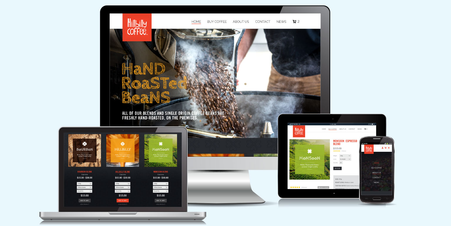
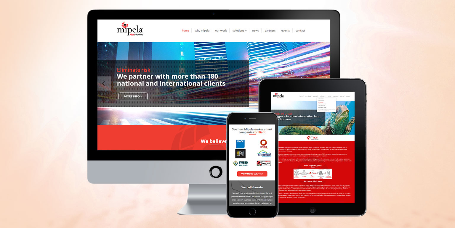
The discipline of designing a website first for a desktop, then considering how it will look on a mobile device has been turned on its head. Many websites are now designed around the smallest potential viewing platform, for example 1334×750 pixels for a iPhone6, and their design layouts are then adapted to larger screen displays where the content can be flowed to a wider browser window and presented horizontally as well as vertically.
Also for probably a couple of years now, Google has been penalising websites that aren’t responsive to mobile platforms, so if SEO is important to your business, but you are still running a site that was designed pre-smartphone, then you have quite a battle on your hands.
Images – a picture saying 1,000 words. We say it in briefing meetings all the time, and in web design it’s truer now than it ever has been. Images bring life to your site, Instagram feeds give it a value of currency, in terms of being live, and the world of web design has seen a move towards less words and more pictures, particularly in combination, especially where the images are relevant to the vision of the business and branding. Ultimately this is being used to better communicate the product or service experience, rather than telling someone about it with lots and lots of words.
Of course, none of these trends are set in stone and what’s proving popular right now may be a thing of the past in 12 months-time. If there is a monumental shift, we’ll let you know on our blog. And not forgetting, if your website needs a monumental overhaul or just an enquiry form to be streamlined, call us. We look forward to discussing it.


